Moo.com on Review
The tools in a writer's toolbox are not limited to just pen, paper, or computer. One that is often forgotten or overlooked is the business card. It takes on the face of the writer in their absence, and as such, says a lot about who they are, what they write, and how seriously they should be taken. A good business card will do many things: provide contact information, hint at the writer's genre, make the author stand out from the crowd, and possibly, help market their material.
Networking is essential to a writer's success in the publishing industry, and up until this semester, I've been neglecting it. Several people asked me for my business card my first residency at Seton Hill and I was chastised twice in my second residency for still not having them.
I decided it was time to remedy the situation.
But where to start? There seems to be so many economical options available when it comes to ordering business cards online. Although this isn't the only route for obtaining them. Your local OfficeMax or Staples or Whateva generally provide this service.
However, I'm a girl who knows her way around Photoshop and a few other Adobe products. I have slightly more than amateur training, so it just feels too lazy not to design something of my own.
My idea was: hypothetical attention-grabbing cover on one side, and basic info with a relevant image on the other. After much debate, and a faintly remembered conversation with someone who liked Moo.com, that's who I picked. (I originally was thinking Vistaprint, but this same friend said that her cards were falling apart in her wallet unhandled. Just being there was causing the ink to flake off, and make the card look really cheap.)
Before showing you the final product, I first wanted to demonstrate what you can expect from the difference in print quality in term of graphics. The following is my original image that I submitted. You can easily find this on my Current Projects tab above.
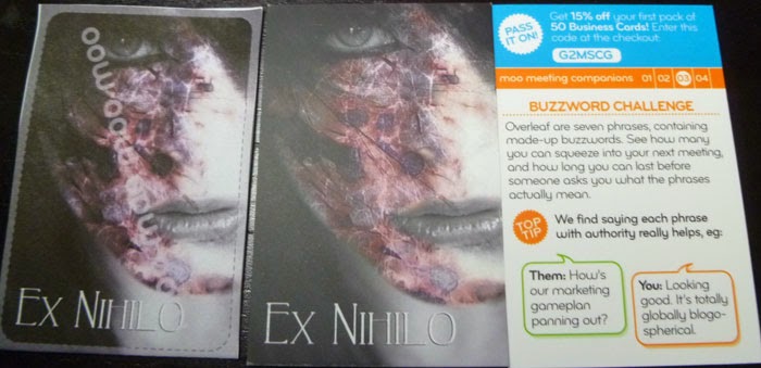
Okay. So this is what I got in the mail. The first image on the right is the PDF mockup that they send to their customers immediately after purchase so that you can print out and have a fair idea of what to expect. This is just plain paper with a typical home color printer. The one beside is the one I received. I tried my best to take a shot straight down so you didn't see any glare from the matte finish, but I really wanted to note the difference in the amounts of lights and darks.
You'll notice that the edge of the face on the final product is noticeably darker, especially nearer to the mouth. Also, the scars aren't quite as vibrant. In comparison with the white streaks, it looks duller. And there's a slight yellowish tinge to the skin tones that was absent in my digital screen settings.
Now the title itself is. I think, my fault. I caught the edge of that in shadow, but this was the most accurate shot I could take to show an accurate representation with what I have bought.
Okay, now beyond the way the paper holds the ink, there's the paper itself to consider. I choose the basic paper that Moo.com offered, and in total shelled out $25 (with shipping) for fifty cards. And I have to say, the quality of the paper is fantastic. It's a very silky matte finish, almost sensual. Above I have an example of the way it catches the light when tilted, and in comparison to bright and dark color schemes.
It just really feels smooth, nice and very professional in between your fingers. It's thick, but not thick enough to pose as any sort of detriment to shoving it into a wallet or wherever. It feels sturdy, and does not crinkle or crease easily. It very much gave me a "Holy shit, this belongs to a legitimate, professional badass" feeling.
Here's a shot of the side, so you have a better idea of what I mean.
Badass, right?
Since I have a feeling that a few people from SHU are likely to see this, I've posted a comparison shot of business cards that I've recently collected. (Admittedly, the one with the rabbit is one I got from Phoenix ComicCon this year with a shirt that reads in French: "I eat little children", but the idea is the same.)
All-in-all, I'm fairly happy with the way these cards came out. I still have yet to see how well these wear over time and with handling, but we'll see how that goes.
One more thing I'd like to point out. Moo has the option of purchasing special business card holders as you finalize your order. At the time, I thought, Pfft. Whatevas. I already have a card holder. So I didn't buy one. Even though they looked pretty snazzy.
In the end, I'm not really sure that anyone would need one. Because my cards came in this snazzy, ultra-smooth, thick box.
When opened, I was greeted by this sight. It's really quite a handy little thing. The more you hand your card out, the more room you have to slide others into the THEIRS slot. It makes it very easy to keep all your cards in one place, and to keep them well-protected at that.
I love the quality of the paper, the convenience of the box, and the price was decent for the result. My graphic didn't print exactly as I would have liked, but that goes to show me that I really need to adjust my Photoshop settings to display realistic print results. For those who don't know how to do that, I'd recommend Google, or at the very least bumping up your saturation and brightness until it looks a tad blown out. Because in the end you'll get a slightly muted version of what you see on your monitor.
It should also be kept in mind that everyone's computer monitors are all a little different, so you might see things differently on your screen than I do on mine.
Cheers.
Networking is essential to a writer's success in the publishing industry, and up until this semester, I've been neglecting it. Several people asked me for my business card my first residency at Seton Hill and I was chastised twice in my second residency for still not having them.
I decided it was time to remedy the situation.
But where to start? There seems to be so many economical options available when it comes to ordering business cards online. Although this isn't the only route for obtaining them. Your local OfficeMax or Staples or Whateva generally provide this service.
However, I'm a girl who knows her way around Photoshop and a few other Adobe products. I have slightly more than amateur training, so it just feels too lazy not to design something of my own.
My idea was: hypothetical attention-grabbing cover on one side, and basic info with a relevant image on the other. After much debate, and a faintly remembered conversation with someone who liked Moo.com, that's who I picked. (I originally was thinking Vistaprint, but this same friend said that her cards were falling apart in her wallet unhandled. Just being there was causing the ink to flake off, and make the card look really cheap.)
Before showing you the final product, I first wanted to demonstrate what you can expect from the difference in print quality in term of graphics. The following is my original image that I submitted. You can easily find this on my Current Projects tab above.
You'll notice that the edge of the face on the final product is noticeably darker, especially nearer to the mouth. Also, the scars aren't quite as vibrant. In comparison with the white streaks, it looks duller. And there's a slight yellowish tinge to the skin tones that was absent in my digital screen settings.
Now the title itself is. I think, my fault. I caught the edge of that in shadow, but this was the most accurate shot I could take to show an accurate representation with what I have bought.
Okay, now beyond the way the paper holds the ink, there's the paper itself to consider. I choose the basic paper that Moo.com offered, and in total shelled out $25 (with shipping) for fifty cards. And I have to say, the quality of the paper is fantastic. It's a very silky matte finish, almost sensual. Above I have an example of the way it catches the light when tilted, and in comparison to bright and dark color schemes.
It just really feels smooth, nice and very professional in between your fingers. It's thick, but not thick enough to pose as any sort of detriment to shoving it into a wallet or wherever. It feels sturdy, and does not crinkle or crease easily. It very much gave me a "Holy shit, this belongs to a legitimate, professional badass" feeling.
Here's a shot of the side, so you have a better idea of what I mean.
Badass, right?
Since I have a feeling that a few people from SHU are likely to see this, I've posted a comparison shot of business cards that I've recently collected. (Admittedly, the one with the rabbit is one I got from Phoenix ComicCon this year with a shirt that reads in French: "I eat little children", but the idea is the same.)
This comparison shot is a large file, should you feel like clicking and inspecting for further detail. But you'll notice that Moo.com's card is a little wider and a tad shorter than any of the business cards I have pictured here. For anyone who has Tom's card, it's not as shiny but it is smoother and about double the thickness. Out of all the ones I have here, Tom's is the thickest (besides Moo's). (I don't know if you'll see this Tom, but your card is pretty awesome. It definitely pulls its weight and does a lot for you.)
But anyway, that's enough of the back. Here's what the front looks like.
All-in-all, I'm fairly happy with the way these cards came out. I still have yet to see how well these wear over time and with handling, but we'll see how that goes.
One more thing I'd like to point out. Moo has the option of purchasing special business card holders as you finalize your order. At the time, I thought, Pfft. Whatevas. I already have a card holder. So I didn't buy one. Even though they looked pretty snazzy.
In the end, I'm not really sure that anyone would need one. Because my cards came in this snazzy, ultra-smooth, thick box.
 |
| Dancing Bear Not Included |
Final Thoughts
It should also be kept in mind that everyone's computer monitors are all a little different, so you might see things differently on your screen than I do on mine.
Cheers.


